Presentation of Data
When the work of collection of data is over, the next step to the investigator is to find ways to condense and organise them in order to study their salient features. Such an arrangement of data is called presentation of data.
Suppose there are 20 students in a class. The marks obtained by the students in a Mathematics test (out of 100) are as follows:
45, 56, 61, 56, 31, 33, 70, 61, 76, 56, 36, 59, 64, 56, 88, 28, 56, 70, 64, 74
The data in this form is called raw data. Each entry is called a value or observation.
Now, arrange these numbers in ascending order:
28, 31, 33, 36, 45, 56, 56, 56, 56, 56, 59, 61, 61, 64, 64, 70, 70, 74, 76, 88
You can get the following information:
- Highest marks obtained: 88
- Lowest marks obtained: 28
- Number of students who got 56 marks: 5
- Number of students who got marks more than 60: 9
The data arranged in this form is called arrayed data.
Ungrouped Data
Presentation of data in this form is time consuming, when the number of observations is large. To make the data more informative, you can present these in a tabular form.
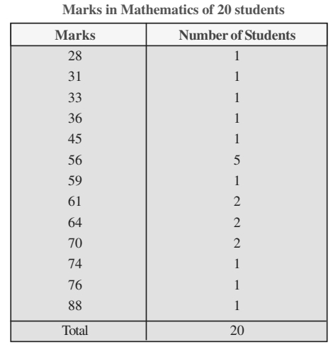
This presentation of the data in the form of a table is an improvement over the arrangement of numbers (marks) in an array, as it presents a clear idea of the data. From the table, you can easily see that 1 student has secured 28 marks, 5 students have secured 56 marks, 2 students have secured 70 marks, and so on.
Number 1, 1, 1, 1, 1, 5, 2, are called respective frequencies of the observations 28, 31, 33, 36, 45, 56, 70. Such a table is called a frequency distribution table for ungrouped data or simply ungrouped frequency table.
When the number of observations is large, it may not be convenient to find the frequencies by simple counting. In such cases, we make use of bars, called tally marks, which are quite helpful in finding the frequencies.
Grouped Data
In order to get a further condensed form of the data (when the number of observation is large), we classify the data into classes or groups or class intervals as:
Step 1: Determine the range of the raw data - the difference between the maximum and minimum observations (values) occurring in the data. For example, range is 88 - 28 = 60.
Step 2: Decide upon the number of classes or groups into which the raw data are to be grouped. There is no hard and fast rule for determining the number of classes, but generally there should not be less than 5 and not more than 15.
Step 3: Divide the range by the desired number of classes to determine the approximate size (or width) of a class-interval. For example, suppose you have 9 classes. Then, the size of each class is 60/9 ≈ 7.
Step 4: Next, set up the class limits using the size of the interval determined in Step 3. Make sure that you have a class to include the minimum as well as a class to include the maximum value occurring in the data. The classes should be non-overlapping, no gaps between the classes, and classes should be of the same size.
Step 5: Take each item (observation) from the data, one at a time, and put a tally mark against the class to which it belongs. For the sake of convenience, record the tally marks in bunches of five, the fifth one crossing the other four diagonally.
Step 6: By counting tally marks in each class, you get the frequency of that class. The total of all frequencies should be equal to the total number of observations in the data.
Step 7: The frequency table should be given a proper title so as to convey exactly what the table is about.
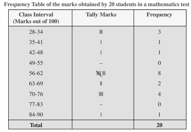
The above table is called a frequency distribution table for grouped data or, grouped frequency table.
The class 28-34 includes the observations 28, 29, 30, 31, 32, 33 and 34; class 35-41 includes 35, 36, 37, 38, 39, 40 and 41 and so on. So, there is no overlapping.
For the class 28-34, 28 is called the lower class limit and 34, the upper class limit, and so on.
From this type of presentation, you can draw better conclusions about the data. For example,
- The number of students getting marks from 28 to 34 is 3.
- No students has got marks in the class 49-55. No student has got marks 49, 50, 51, 52, 53, 54 and 55.
- Maximum number of students have got marks from 56 to 62.
Cumulative Frequency Table
In the table, if you insert a column showing the cumulative frequency of each class, you get cumulative frequency distribution or simply cumulative frequency table of the data.
For example,
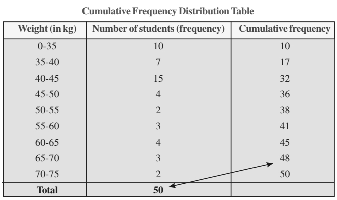
The frequencies 10, 17, 32, 36, 38, 41, 48, 50 are called the cumulative frequencies of the respective classes. The cumulative frequency of the last class, i.e., 70-75 is 50 which is the total number of observations.